ShopDreamUp AI ArtDreamUp

Deviation Actions
Outtake Collection
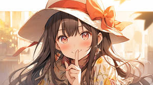
I publish my music on Youtube every day. The illustrations uploaded to devian art were generated by AI for uploading to Youtube. This subscription allows you to view outtakes. And I can support my motivation for activities.
*Even if you subscribe to this, it does not mean that I will generate the picture you want.
$1/month


Suggested Deviants


Suggested Collections


You Might Like…


Featured in Groups


Description
Choices...Choices...Choices.
Yay for new submissions! : D
Got really inspired by a bunch of quotes I've read, haha! So I made this : D Hope you guys like~
Please support my sketch blog >> Hoshiakarinosora @ TUMBLR
--
Yay for new submissions! : D
Got really inspired by a bunch of quotes I've read, haha! So I made this : D Hope you guys like~
Please support my sketch blog >> Hoshiakarinosora @ TUMBLR
--
- Tools: Mech Pencil, watercolor, PSCS3
Time: Sometime in 2 days XD
Image size
2002x1395px 3.5 MB
Comments496
Join the community to add your comment. Already a deviant? Log In
This deviation has been in my favourites for quite a while, and it's high time I wrote another critique.
Let me just start out by saying that this was the background image on my Blackberry for the LONGEST time. So that's five stars for impact - any image that lasts as my wallpaper for longer than 24 hours definitely had some kind of profound impact on me. Just looking at how often my dA avatar changes can tell you that. You've also inspired me to start something like this in my bedroom (but with magnet boards instead of strung along the wall).
As for the more technical details...
Shading? A+, especially when it comes to consistency. In other words, you don't make the shading super detailed in some places and virtually nonexistent in others - that's taking it to the extreme, but you hopefully get what I'm trying to say.
The color scheme also really ties the whole picture together - mostly reds and oranges (the hair, the pants, the polka-dotted cami and most of what's hanging on the wall), interrupted with some patches of yellow (the sticky notes, the stars), and the greens for contrast, all tied together with a sort of creamy-white background color. It gives me the impression that the girl is standing in a sunlit place - a room with all the curtains open, a treehouse, etc.
You also play around with patterns really well. The stripes and polka-dots on the girl's clothes, and in the objects hanging from the wall, you have stars, stripes, and plaid. The wood texture of the background also isn't overwhelmingly detailed, which kept my attention focused on the girl and the stuff on the wall.
Ways to improve? The main thing, I'd say, is be careful not to distract from the most important part of the picture. For this image, I'd say that's probably the girl - my eyes should be immediately drawn to her, and then follow along the ribbon to see all of her trinkets and pictures and such. The red-and-orange-plaid cloth (handkerchief? bandana? something like that) doesn't have the same sort of diluted (is that the right word?) colors as the other things hanging on the walls - it sort of distracts my attention from the girl.
Basically, this is great. Keep up the good work!
ASH